The role of Landing Pages in moving consumers through the sales funnel is not a mystery. These stand-alone Web Pages are hands down the best conversion tools. In fact, 48% of marketers build an exclusive landing page for each of their marketing campaigns.
However, creating a landing page that can actually convert is one of the biggest challenges faced by marketers.
In this blog, we shall discuss a few iconic landing pages that you can draw inspiration from. But before we dive in. Let's understand how a landing page would benefit your brand’s health.
Your Website is certainly the biggest asset for your brand. It beholds everything and anything that your consumers would want to know about your company. But directing all your traffic to the homepage of your website can be a big pitfall. Because your homepage can only confuse your leads and drive them away.
But then where should you direct your PPC traffic?
The answer would be a Landing Page.
What Is A Landing Page?
Landing pages are standalone web pages that are tailored for a specific marketing or advertising campaign. These pages are also known as Lead Capture Page.
Your leads end up landing on this page as a result of a lead magnet that you place on various platforms.
While directing these leads to websites can be a good idea, directing them to a stand-alone page can be great for lead qualification and conversion.
Landing Page is an extremely effective lead generation strategy too.
That is because they talk only about a specific product, service or offer. Therefore, they act as gates for only qualified leads.
And if you do it the right way, you will be able to boost your conversions up to 300%.
15 Best Landing Page Examples
We’ve curated 15 examples to help you understand what goes into the making of a great landing page that converts. Here we go...
1. Slack

Slack’s motto is to replace the conventional use of emails. The company uses a great structure in its “Sign Up for Free” landing page.
The plain blue background displays a white contrast text and sign up section. All it asks is for an email. At one side lies the snippet of the app.
What worked?
- The value proposition is upright which makes it super attractive.
- The CTA is quite bright and flashy with a 22 words long description. Short, sweet and simple.
2. AirBnB
.jpg)
AirBnB is one of the most trusted brands in the world. This online rental marketplace based in America owes a huge chunk of its success to the amazing user experience that it provides its audience.
The company’s “become a host” landing Page was one major point of sales for the company. The minimal designing and to-the-point visuals worked a long way in the company's conversions.
What Worked?
- The card with the CTA acts as an interaction focal point that lets the audience interact seamlessly.
- The visual clarity reduces the cognitive load on the user incredibly.
3. Apple
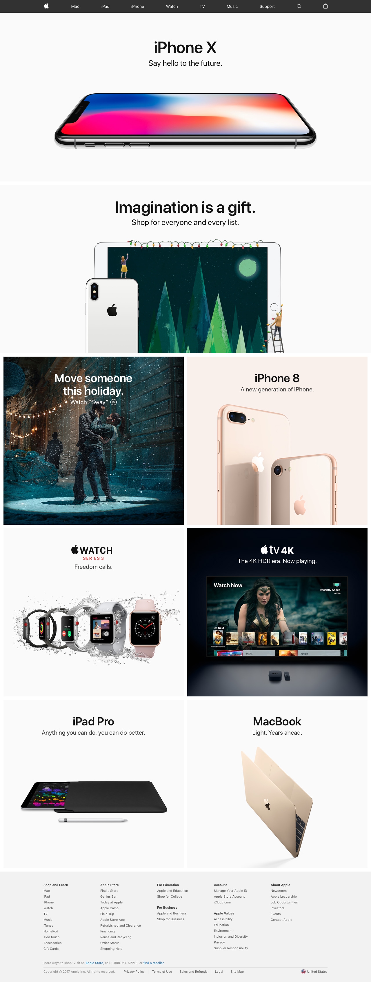
Apple is a brand that epitomizes simplicity and this stands true in the case of its landing page too.
The landing pages of the new launches pretty much let the brand do the talking. It gives the audience two, straightforward choices - ‘Learn more’ or ‘Buy’.
What worked?
- The aesthetics in the landing page are something that the whole world loves
- The CTA is not just confidence but also exudes the maker’s confidence in the pro
4. Netflix
This popular OTT platform is hands down, every netizens' favorite. When the company eventually started out, it’s “try 30 days free” Landing Page indeed played an instrumental role.
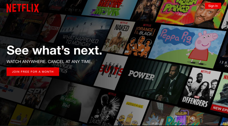
The bold, red-themed page was precise and impactful. While most of the companies place “pricing” as the main message of the web page, Netflix makes its value proposition, the star.
What Worked?
- Netflix highlights the dearie’s that appeal to its target audience in bold letters. This way the visitors were easily able to skim through the page.
- The CTA is simple and sleek. It only asks for the email ID.
5. Upwork
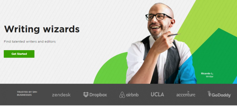
This popular gig economy has landing pages for each of its categories. Each of these pages follows a great structure.
It includes the actual workforce, names of customer brands, instructions and a very compelling CTAs.
What Worked?
- They address a specific set of the target audience
- They uprightly address all the concerns the viewers would have
6. Uber
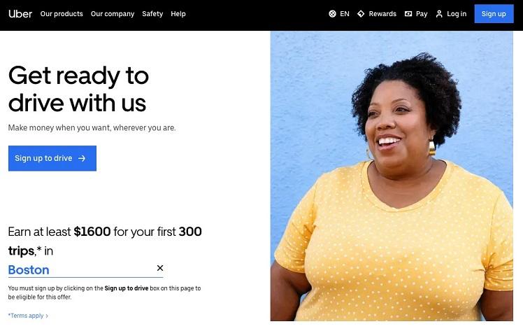
Uber has no doubt become a household name.
Uber’s landing page that was made for capturing bike riders was a stellar one. The logo at the top of the page reminds the brand that the company built. The beauty of this landing page lies in the sweetness of its words.
What Worked?
- The copy is quite to-the-point without wasting any lead’s time
- The page does not have any Navigation whatsoever, much to the convenience of the visitors.
7. Wistia
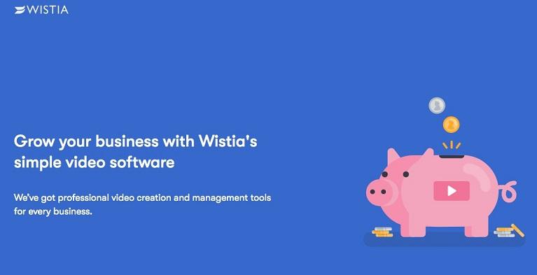
Wistia’s Video Software landing page is an epitome of minimalism. Blue, patterned background with a contrast contact form is so compelling that the lead would be tempted to give out information.
Besides, the contact form is very simple and sweet asking for just the basic information.
What Worked?
- The landing pages wastes no one’s time. It is short, sweet and uncluttered.
- No lead leaves with questions. As he scrolls down all the FAQs would be answered.
8. Unbounce

Another example of a landing page who’s contact form steals the show is Unbounce. The brand’s landing page for the “7-day course” on how to generate leads replaced the conventional contact form with a classic char window. Another way of tempting your viewers to give out information.
What Worked?
- The landing page is a combination of what the readers want to read and what the makers want to show the viewers.
- Besides, the contact page, the structure of the page is commendable
9. Square
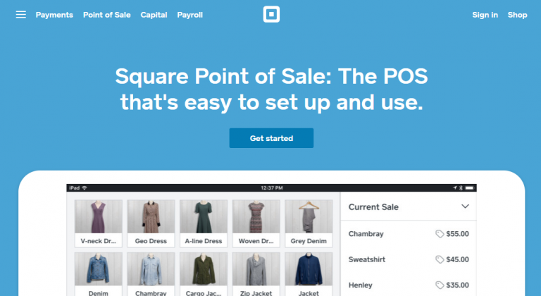
The company’s “Point-of-Sale product's" landing page is all for great headlines and a greater CTAs. While the viewer’s attention is grabbed and retained by the first half of the landing page, the second half demonstrates the working of the product.
What Worked?
- The page acts as a one-stop guide for the prospects.
- Impactful play of words.
10. HostGator
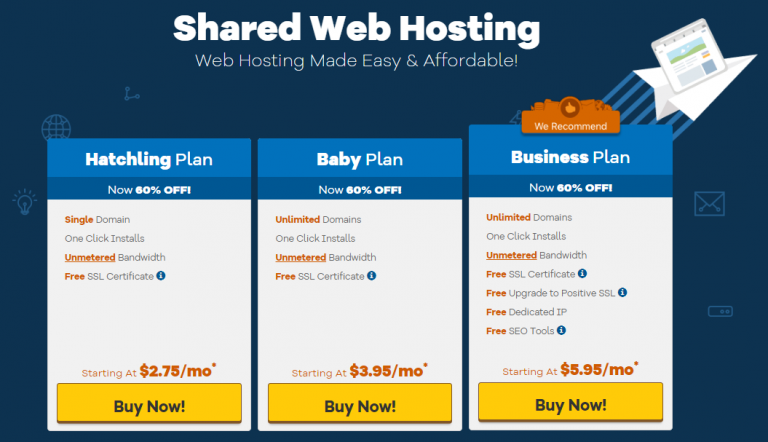
HostGator is certainly one of the best web hosts in the market. It is no surprise that the company’s landing page is equally impressive. Especially the one for shared web hosting makes a great example of a landing page that converts.
The simple and yet well-packaged pricing plans placed at the heart of the page is the second best part about the page. The first best thing about the page is the design with hand-drawn elements. They are absolutely adorable.
What Worked?
- The creative designing backs the web hosting platform incredibly
- it's to the point yet well-packaged information
11. Wix
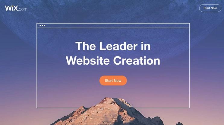
This Israeli based web developer is now a known name to every marketer. Its signature “Sign Up” landing page has indeed played an instrumental role in gaining customers for the company. Its power lies in its aesthetics. The magnificent picture of a mountain and sky does all the magic.
What Worked?
- The CTA is right in front of the viewer. This works because the viewer’s instinctive reaction would be to hit the button.
- The minimal yet powerful graphics make the “Start Now” button the showstopper
12. Shopify
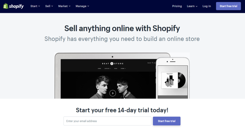
Shopify’s “Sell Anything With Shopify” is another great example of a landing page that converts. We probably have given our email address too. Because that is all it asks for. The curt CTA with beautiful images serves the purpose so damn well.
What Worked?
- The landing page reassures its visitors with not just social proof but also with the play of words
- The page is all you need to understand all about Shopify
13. Lyft
Lyft’s “Drive With Lyft” landing page is for collecting surveys from its audience.
If you have worked with surveys before, you would agree with me that making clients take out time for your brand is pretty challenging.
Lyft does it exceptionally well with its beautiful landing page that has a flat purple background.
What Worked?
- The landing page lets the visitor take one step at a time, making it very motivating for the visitor.
- The page is devoid of any distractions, letting one focus only on the main part
14. GoBlog
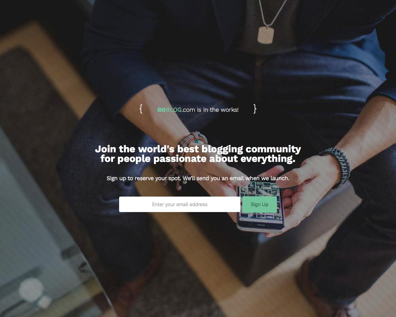
GoBlog is a WordPress theme for Blogs by Themeforest. Before the theme was officially launched in 2014, Themeforest released a standalone webpage for the theme.
All it had was a headline with a CTA. This page is a great example of the phrase “keep it simple”.it had no over the top design or excessive matter whatsoever. Yet it worked simply for its powerful phrases and background image.
What Worked?
- The landing page has no graphics apart from a background with a man holding his phone. This is just a hint of assurance for the visitors that the themes are going to be extremely user-friendly.
- There are less than 40 words on the landing page. It took seconds for a visitor to consume.
15. Spoil

There is a reason why Spoil’s Reorder Page is in the end. That is because it is one of our favorites. Spoil is a one-click gifting company. But before the official launch, the company released a Pre-order landing page.
Now getting your audience to preorder even before you launch your product is a tough task. But Spoil beautifully executed this by showing social proof.
The page shows the pricing, the number of people who pre-ordered and the number of hours left at the heart of the page. Boom! The rest is history.
What Worked?
- The landing page creates a sense of urgency
- The designing is highly targeted with visuals that are both educating yet easily understood
What Makes A Great Landing Page?

Now that you have 15 landing page examples to draw inspiration from, let go ahead and understand how we can incorporate this into our landing page.
Here are some tips that will help you demarcate your Landing Page from the tones and tones that are already present in the market
1. Keep Short and Sweet
The whole point of having a landing page tailored to a specific campaign is that it must cut through the clutter and reach your leads. That is why it is important to keep your Landing Page sweet, short and devoid of unnecessary content.
Keep only the stuff that is relevant and ditch anything that is even slightly unimportant.
2. Let Headlines and CTAs Do The Talking
90% of the visitors who read your headline will read your CTA too.
Headlines and CTAs are synonymous with Landing pages. They decide the fate of your conversions. They must be catchy, unique and precise.
Trust me, having great CTA copies will boost your lead generation like never before.
3. “One Landing Page, One Offer”
Standalone Web Pages can increase your conversions up to 87%. Yet there is a whole graveyard of landing pages. Why is that?
That is because a lot of marketers sabotage the whole purpose of a landing page by including too many offers, products or services. This just makes your landing page just another page of your website.
Follow this thumb rule- “One Landing Page, One Offer” and let the magic unfold.
4. Make Interactive Landing Pages
Personalization is the present and future of marketing.
And this applies even for landing pages. But how can you make one that is personalized for each of your leads?
The answer is ”interactive elements”. Adding interactive videos or hotspots to your landing page can create wonders. You are not only personalizing your page for each lead but you are also giving them a great user experience.
How VideoForm Can Boost Your Landing Page Conversions
Now that you've taken the decision of making a landing page for your campaign, why not just go ahead and make an innovative one that stands out in the market?
VideoForm combines the power of landing pages and video marketing and tops it up with interactive elements.
The result is a stellar landing page that helps your leads interact with you instantly and boosts conversions.
VideoForm is a video personalization platform that can help boost your landing page conversions. By using personalized videos, you can create a more engaging and relevant experience for your website visitors. This can lead to increased conversion rates and improved customer satisfaction.
As a result, each visitor will see a video that is tailored specifically for them, increasing the likelihood that they will convert on your page.
If you're looking for a way to improve your website's conversion rate, then consider using VideoForm's personalization platform. It can help you create an engaging and relevant


